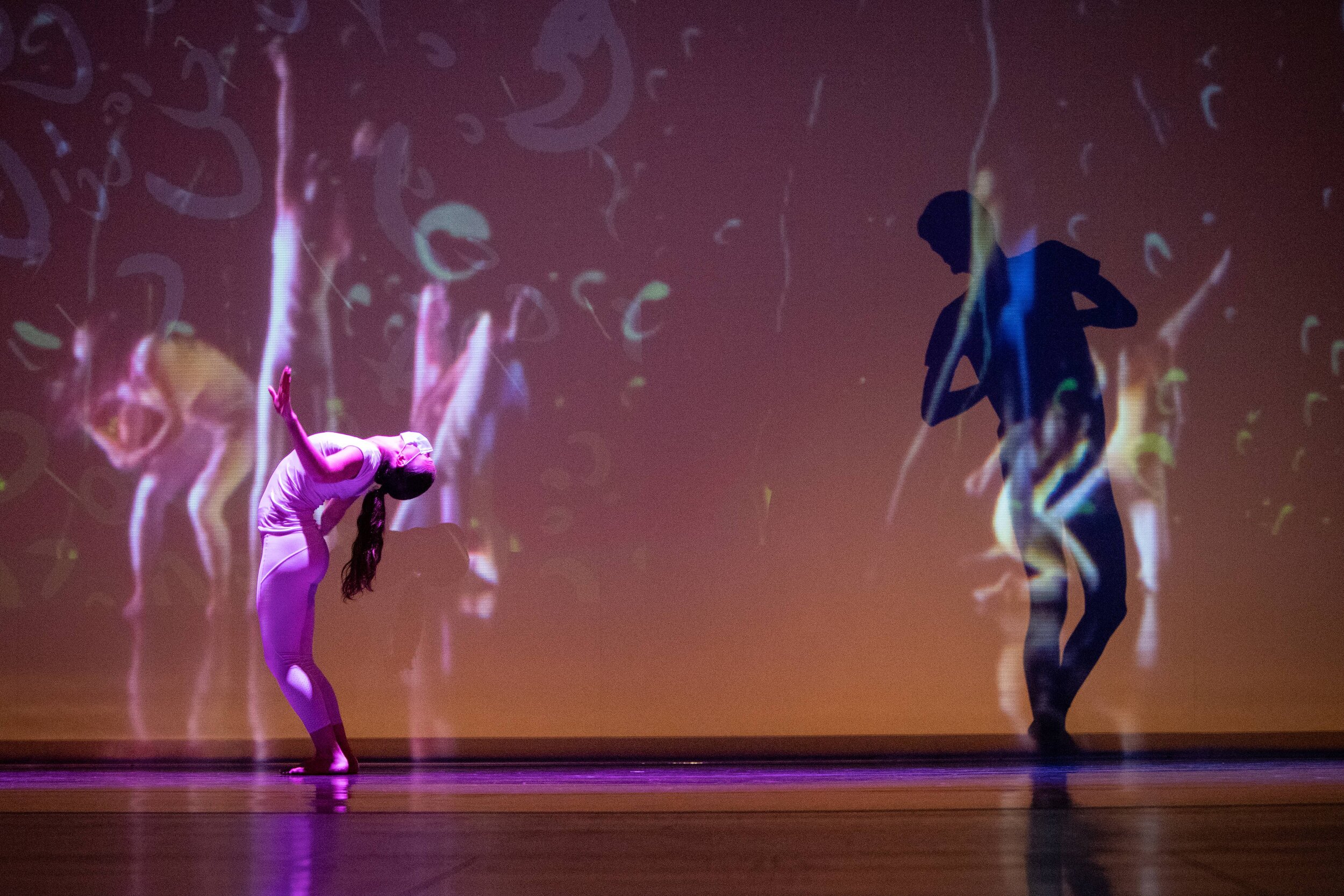
Where We Meet
Part of the initial premiere of the University at Buffalo’s Home and Away remote dance recital, Where We Meet explores social distancing both literally and digitally, via both silhouette, the manipulation of shadow and physical distance, paired with the usage of digital form in space.
The Team
Projection Designer: Timothy Swenson
Lighting Designer: Francisca Losada Hernandez
Choreographer: Phil Wackerfuss
Video Composition: Phil Wackerfuss
Lighting Programmer: Molly Crandall
Dancers: Stephanie Avila, Kyle Kershner
Music: 'Everywhen' by Massive Attack, Wackerfuss Edit
Photo Credits: Ken Smith, UBPG
Design Concepts
The Process for this piece evolved considerably from our initial expectations of the piece, as is rapidly apparent in the journey from research to production. Phil started the process by giving me an incredible amount of range in what I could present- only stipulating that it felt rainy, and that the some concepts for the story of the piece- a pair of companions, seperated by deed or by circumstance, who dance around each other, coming close but never touching. It would end in a manner that would suggest they could go forward together, or split apart once more, finally.
Seen left is the one of the early research images I followed, trying to pin down what ‘rain’ felt like in this situation.
Gaslamps and Puddles
When I first started researching what a rainy vibe looks like to me, the first thing I though of was London. With that came Gothic architecture, and Gaslamps.
This Gaslamp lighting, to me, felt like the perfect assistant to the dance itself. Taken in the time it was introduced, its the pinnacle of achievement and a sign of innovation. Now, it is a quirk of some cities, romanticized and ridiculed in equal measure. A sort of twilight, where anything could happen- a reversion to the past, or an embrace from the future.
These Gaslamps also helped introduce the color palette I would eventually propose to Phil. Warm and cool lighting interacting and swirling around each other like oil on water. Working with the theme, I thought it fitting that the relative warmth of the projections could shift as the dancers did.
Gothic Arches, and Places to Be
Clock Tower
Thinking of London brings about thoughts of the Gothic variety for me. The arches and gloomy skies certainly fit the bill of indecision and isolation that the piece shows us. The looming nature of the architecture, all arches and spires, reflected in the choice that the characters must soon make- to stay, or to separate?
A Destination in Mind
This piece in particular- concept art from the game Bloodborne- is what I based much of the next iterations on, before the concepts evolved. The idea of having so clear a goal to reach for- reconciliation, perhaps- but a difficult or obscured path to achieve it fit incredibly well into the story, and so this research image became the base upon which I’d build a place for this story to play out on.
Gothic Ideations
Above is my first pass at editing the research image into something soft enough that it could be used without issue in the piece. This was accomplished with a mixture of AI-based painting programs and manual edits to smooth out the harder lines and soften the tone so that it would feel more indecisive.
The second iteration of the gothic background, and the last. After changing that version around a bit, I wanted to warm up the back drop a bit more, as while the clock tower was nice, it wasn’t enough. Felt more like a moth-lantern than a destination. So I painted some gaslamps- both to fit the concepts in my head, as well as provide a clear ‘path’ forward. The final step in this process was animation, which was to be supplied in two parts. Firstly, the lamps and tower would ‘flake’ embers or fireflies, to add a bit of dynamic movement to the warmth. Over it all would be a light drizzle, to serve as the dynamic component for the cooler side of things.
A New Direction
Eventually, we decided that the gothic/gaslamp creation, while evocative of the themes, was in fact too busy for what we were trying to accomplish. With the addition of projected dance elements- which is to say, prerecorded dance segments projected then filmed live- the gothic drop would not facilitate their use. So we cut that, and I swapped over to focusing entirely on the rain elements of the piece.
In order to do this appropriately, I looked for all manner of solutions to making a satisfying ‘rain on a window pane’ look. From pouring water over glass in my bathtub to waiting for storms, I eventually came to the conclusion that a realistic approach was outside of my means in the timeframe we had, and so moved to animated versions. I settled on a simple white GIF of raindrops, that I proceeded to rotoscope over in different colors, tending towards the cooler tones of the earlier Gothic pieces. This technique not only allowed for rapid idealization (well, as rapid as animation can get anyhow), but the imperfections in tracing lent a sense of depth and perspective to an otherwise flat look.


